People are visiting your website, but few are getting in touch. More traffic might sound like the answer. First, look at what happens after someone arrives.
A visitor needs to recognize that your business can help, find answers to their questions, and feel comfortable taking the next step. If any part of that experience breaks down, the visit can end without an inquiry. These 7 causes will help you find where that might be happening.
1. Your Website Doesn’t Clearly Explain What You Do or Who It’s For
A visitor should not have to study your homepage to figure out whether your business is relevant to them. Yet many websites lead with broad lines such as “Solutions for your success” or “Quality service you can trust.” Those lines may sound positive, but they leave the visitor with the same questions they had before arriving: What do you offer, and is it meant for someone like me?
Start with the first screen of your homepage. Without scrolling, can someone identify your service, the people or businesses you serve, and the next useful step? If the answer depends on knowing your business already, your opening needs more detail.
Compare these 2 approaches:
- Helping you reach your goals with service you can count on.
- Bookkeeping and monthly financial reports for small businesses in Modesto.
The second example gives the reader something to assess. A business owner looking for bookkeeping can see a possible match. Someone looking for personal tax preparation can tell that they may need to look elsewhere. That clarity saves time for both people.
Your service pages need the same attention. A page titled “Our Services” may list everything you offer, but each service still needs a plain explanation of what the work includes and who usually needs it. Do not make visitors piece the answer together from short cards, unexplained terms, and an invitation to contact you for details.
Check the language customers use when they describe their problem. They may search for “help fixing a leaking roof” before they know the name of a particular repair. Your website can use accurate industry terms while also explaining them in words your customers recognize.
Read your homepage aloud, then ask someone unfamiliar with your business to describe what you do. If their answer is vague or incorrect, revise the opening before changing its colors, images, or layout.
2. Visitors Don’t Trust Your Business Yet
Finding the right service is only the first step. A visitor may still wonder whether your business is established, whether you have done similar work, and what it will be like to contact you. If your website offers no way to answer those questions, the visitor has to take your claims on faith.
Trust is built through specific, verifiable details. Your website might show examples of completed work, explain your process, identify the areas you serve, or introduce the people a customer will work with. Relevant reviews can help when they describe an actual experience rather than offering generic praise.
The details should fit your business. A contractor might show finished projects and explain what happens during an estimate. An accountant might describe the types of clients the firm serves and what documents a new client should prepare. A local business should make its location and service area easy to find.
Be careful with claims that could belong to anyone. “We care about our customers” tells a visitor little about how you work. “You’ll receive a written estimate before work begins” gives them a concrete expectation. If there are limits or conditions, state those too.
Look at your website as someone who has never heard of your business. Can they find a real business name, a way to contact you, and evidence that your services match what you say you do? Are testimonials attributed in a way that makes sense, with permission from the customers involved? Are project examples current and explained well enough to be useful?
Trust can also be weakened by contradictions. A page that lists an old address, a team member who has left, or a service you no longer offer creates uncertainty. Check your homepage, service pages, contact page, and business listings for conflicting information.
You do not need to fill every page with reviews and credentials. Put the most relevant evidence near the decision it supports. A project example beside a service description can answer a visitor’s question at the moment they are considering that service.
3. Visitors Don’t Know What to Do Next
A visitor may understand your service and trust your business but still leave if the next step is unclear. This happens when a page ends without direction, a contact link is hard to find, or every button uses a vague label such as “Learn More.”
Decide what you want a visitor to do on each important page. Someone reading an overview may need to explore a specific service. Someone reading a service page may be ready to request a quote. Those pages do not need identical calls to action because the reader is at a different point on each one.
Make the action clear in the button text. “Request a Quote,” “See Our Website Design Work,” and “Ask About Availability” tell the visitor what will happen next. “Get Started” can work in context, but on its own it leaves room for doubt.
The text around a button matters too. If someone is being asked to fill out an inquiry form, explain what information you need and what the business will do with it. A brief note about the next step can remove uncertainty without making a promise you cannot keep.
Check where your calls to action appear. A visitor should not have to return to the top of a long service page to find the contact option. At the same time, repeating the same button after every short paragraph can make a page harder to read. Place it where a reader has enough information to decide.
Make sure the destination matches the label. A button that says “View Pricing” should lead to pricing, if pricing is available. A “Schedule a Call” button should lead to a scheduling option. Sending every button to a general contact page adds a step the visitor did not expect.
Walk through your website as if you were considering a purchase. At the end of each page, can you tell where to go and why? If you find yourself choosing between several equally prominent options, give the page one primary next step and make the others secondary.
4. Their Questions Aren’t Being Answered
Visitors often leave because they cannot find an answer they need to make a decision. They may want to know whether you serve their location, how your service works, what is included, how long a project typically takes, or whether you work with businesses their size.
Those questions are not minor details. They can determine whether someone contacts you at all. If your website says little beyond a service name and a short sales paragraph, the visitor must either ask for basic information or keep searching. Some will choose the second option.
Start with the questions people already ask in emails, calls, and meetings. Make a list of the ones you answer repeatedly. Then look for the page where each answer belongs. A question about what a service includes belongs on that service page. A question about how to begin may belong beside the contact form.
Answer directly before adding explanation. If you serve Modesto and nearby communities, say so. If pricing depends on the scope of work, explain what affects the quote and what someone must provide to get one. If you do not offer a service, a clear boundary can prevent inquiries that neither side wants.
You do not need to publish every internal detail of your process. Give visitors enough information to decide whether it is worth starting a conversation. The goal is to reduce avoidable uncertainty, not to replace every discussion with a long page of text.
An FAQ can help, but it should not become a place where all useful information is hidden. If most visitors need to know that an initial consultation is required, say that in the main service copy. Use FAQs for specific follow-up questions that would interrupt the flow of the page.
Review your inquiries from the past few months. Which questions came up before a customer could move forward? Which assumptions did people make that you had to correct? Those are signs that your website may need a clearer explanation.
5. Your Website Is Slow or Hard to Use on a Phone
Even useful content is difficult to act on when a page takes too long to load or is awkward to use. A visitor on a phone may give up while waiting for a large image, miss a button hidden behind a menu, or struggle with a form whose fields are difficult to tap.
Open your website on a phone and complete the same tasks you expect a customer to complete. Find a service, read its details, reach the contact page, and send a test inquiry. Use a mobile connection if you can. A page that feels quick on your office computer may behave differently elsewhere.
Pay attention to the text as well as the technical performance. Is the type large enough to read without zooming? Do headings and paragraphs fit the screen? Are buttons separated enough that you can tap the intended one? Does a popup cover the content or block the close button?
Images are a common place to investigate when pages feel slow. Uploading an image much larger than the space where it appears can add unnecessary weight. Videos, animations, and third-party features can also delay the content a visitor came to see. Review what each element contributes before keeping it.
A speed test can identify possible issues, but use the website yourself too. A score cannot tell you whether a sticky header covers a heading or whether a phone number is hard to tap. Check the pages people actually visit, particularly the homepage, key service pages, and contact page.
Make one improvement at a time where practical, then check that the page still works. Compress an oversized image, simplify an intrusive popup, or correct a form layout. The point is to make the information and next step usable for the person holding the phone.
6. Your Contact Forms May Not Be Delivering the Inquiries
Sometimes the visitor does everything you hoped they would do. They fill out the form, press submit, and see a confirmation message. The business never receives the inquiry.
A form can fail in several places. A submission might not save, the notification might be sent to an old address, or the email might land in spam. A confirmation message only shows what the visitor saw. It does not prove that someone at your business received the details.
Send a test submission through every important form on your website. Use an address outside your business for the test, fill in every required field, and check what happens after submission. Then confirm that the inquiry reached the correct inbox with all the information intact.
Do not check only the inbox. Look in spam and any form-entry records your website keeps. If an entry exists on the website but no notification arrives, the issue may be with email delivery. If there is no entry, investigate the form itself. These are different problems and may require different fixes.
Check where notifications are configured to go. A former employee’s address or a shared mailbox no one monitors can make a working form look broken. If multiple people receive inquiries, decide who is responsible for responding so a message is not overlooked.
Review the form from the visitor’s side as well. Required fields should be limited to what you need for an initial reply. Error messages should say which field needs attention, and the confirmation should make it clear that the submission went through.
Test again after website updates, form changes, or email configuration changes. If your website depends on inquiries, a periodic test is a practical check. It takes little time and can uncover a problem that traffic reports would never show.
7. You’re Attracting the Wrong Visitors in the First Place
A website can have steady traffic and few inquiries because the people arriving are looking for something else. They may be researching a topic, seeking a service you do not offer, or visiting from outside your service area.
This is why traffic alone does not tell you whether your website is doing its job. A blog post that answers a broad question may bring many readers who have no reason to hire your business. A service page with fewer visits may bring people who are closer to making an inquiry.
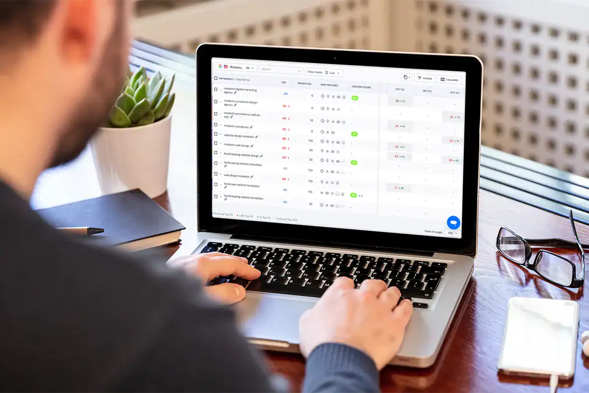
Look at the pages where visitors arrive and the search queries that bring them in, where that information is available. Compare those topics with what you sell and who you serve. If a page attracts people asking how to do a task themselves, consider whether it also helps the right reader understand when they might need your service.
Check the language in your page titles and headings. Broad terms can attract broad traffic. A page about “website help” gives less context than one about WordPress website maintenance for small businesses. Specific wording helps the right visitor recognize the page, even when it reaches a smaller audience.
Location can matter as well. If you only serve clients in a defined area, make that area clear on relevant pages. If you work remotely, explain what that means for the customer. Avoid adding location names to pages that do not genuinely address those places or the services you provide there.
Do not judge every article by whether it produces immediate inquiries. Some articles answer early questions and lead readers to a more relevant service page later. Make that connection useful: link to the related service when it helps the reader take the next step.
Start by comparing traffic with actual inquiries, not traffic with a target number of visits. Which pages bring people who ask about the services you offer? Which bring unrelated requests? The pattern can show whether you need to revise a page, clarify its audience, or change the topics you pursue.
Where to Start
You do not have to change every page at once. Start with the path a potential customer is most likely to take: the page where they arrive, the service page they read, and the form they use to contact you. Follow that path on a phone and write down each point where the answer or next step becomes unclear.
Test the form early. Then address the clearest obstacle you found, whether that is a vague opening, missing service details, or a page that is difficult to use. Make the change and review the path again.
If you want another set of eyes on that experience, AJT Digital Designs can review your website and discuss what needs attention.
Frequently Asked Questions
Why is my website getting traffic but no leads?
Traffic shows that people reached your website. It does not show whether they wanted your service, understood your offer, or were able to contact you. Review the pages they entered, the questions those pages answer, and the route to your contact form. Test the form before assuming visitors chose not to inquire.
How do I know if my website's message is clear?
Show your homepage to someone who does not know your business. After a brief look, ask what you offer, who you serve, and what they would do next. If they cannot answer without guessing, revise the main heading and opening text. Repeat the check on your most important service pages.
Should I add more calls to action?
Add a call to action where a reader has enough information to make a decision or needs a clear route to the next page. More buttons alone will not fix missing explanations. Give each page a primary next step, use a label that describes it, and check that the button leads where a visitor expects.
What should I check if nobody is submitting my contact form?
Submit a test inquiry yourself. Confirm that the form accepts it, that the entry is saved if your website stores entries, and that the notification reaches the right inbox. Check spam and the form’s notification address. If the submission is recorded but no email arrives, investigate email delivery.
Do I need more website traffic to get more inquiries?
First, check whether your current visitors are relevant and can use the website without obstacles. More visits from people looking for something you do not offer will not address a mismatch. If the right people are arriving but leaving with unanswered questions, work on the page experience before focusing on traffic.